· Documentation · 6 min read
Redesign the referral program at Aprende Institute
One of my challenging tasks at Aprende Institute was to redesign the referral program. This program is important because it generates part of the revenue, and we need to understand the motivations of the students to refer others, as well as the needs of guests to convert them into students. This is an end-to-end product that was required careful consideration.

Dream team
Team - UX Designer Lead / UX Designer JR / UX Researcher SSR / UX Writer SSR.
My Rol - Coordinate / Design system / Metrics follow Up
Date and Deadline - 2022 / Four Months
Context
The referral program is an opportunity for students at Aprende Institute to share a discount with family, friends, or anyone who wants to enroll.
And the student receives a gift when their family member, friend, or anyone else enrolls.
The problem
Although Aprende has a referral program section, it may not generate sufficient monthly revenue. To increase revenue, we need to understand the motivations and our users’ needs.
The scope was to redesign the program on the web, mobile, and app.
Metrics
Only 17% of active students participate in the referral program. And only 1.9% decide to share the benefits with a friend or family member.
Of the person that decide share the benefit, just the 70% claim the reward.
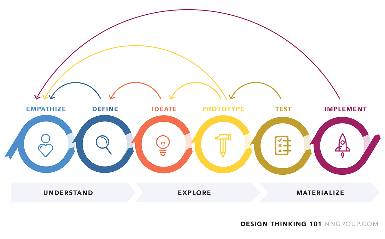
Design thinking
Design Thinking helps us empathize with users, ensuring that the solutions we create are genuinely useful and address real problems.

Benchmark
We explored some referrals program from different companies and explore the complete journey between the company and the user for get hightlights and understand how to use the program.
Interviews
We conducted 20 user interviews to identify pain points and possible causes related to the referral program. Primarily, users mentioned that they didn’t recognize the referral program and had never seen it in the hamburger menu or other sections.
After reviewing the qualitative and quantitative research, we found the following:
- Users didn’t identify the referral program.
- Users who visited the section mentioned that they didn’t understand how the referral program works.
- Most users thought the journey was complicated.
- Users thought the referral program looked like an advertisement page and wasn’t very convincing.”
Some benchmark findings:
Redesign and integrate to Design System
We should create a Design System section for the referral program.
Ranking
The programs involves a ranking strategy with points and rewards, where users who share more receive more rewards
Program explain
The program explains the aim, benefits, and discounts in the first position
FAQs
The landing page includes FAQs to resolve any doubts regarding the referral program. This feature adds credibility to the program
Storytelling
The communication is clear and human to human to sound convincing

Decalartion problem
Users need to easily identify the referral program with quick access to increase its visibility and understand how the program works.
Next steps and planning
According to the previous phase we decided to work on the following points:
- Create the theme for the referral program based on the General Design System.
- Create the tone and voice for the referral program based on the general Tone and Voice manual.
- Build prototypes of the happy path for the landing page in Mid-Fi to run some tests.
- Iterate the prototype with feedback in Hi-Fi.
- Launch version 1 (V.1).
- Metrics follow-up.
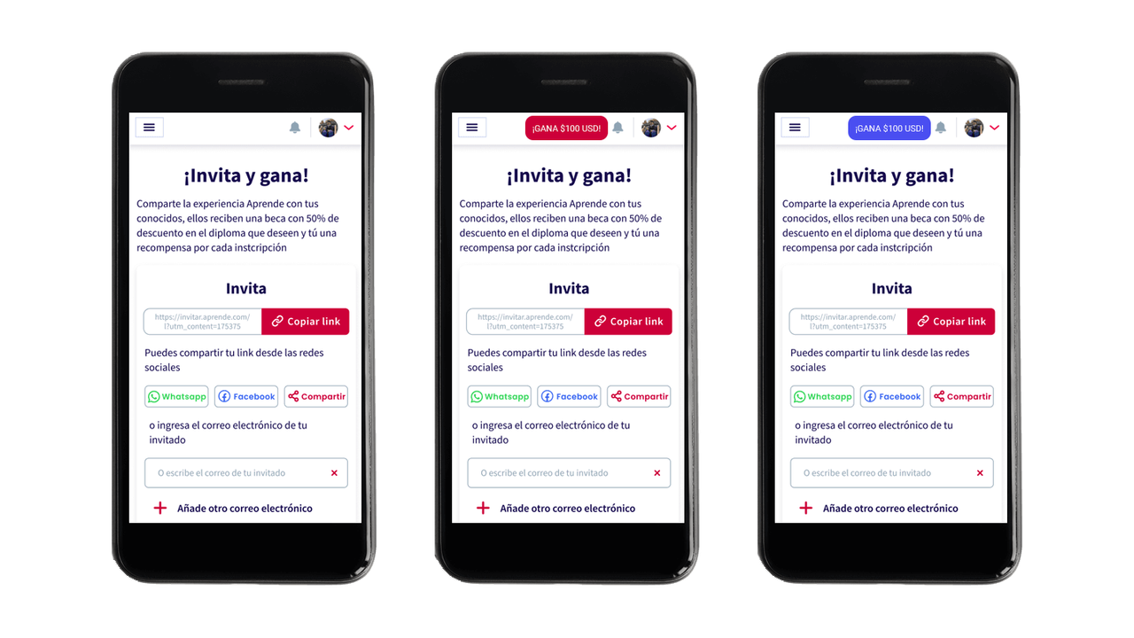
A/B Testing button
In a workshop, we came up with the idea to launch the first A/B/C test for a button to verify the hypothesis that it would increase the visibility of the referral program.
- This A/B was launched in a cohort of new students across all diplomados.

Results
After 15 days we reviewed the metrics and obtained the next results:
- The “C” version was the winner with 70% of click rate
- Increase student participation in the referral program 2%.
For that reasons we decide launch that as a MVP of the referral program.
Design system
Creating a section in the design system for the referral program. We needed to make the program stand out and draw users’ attention without making drastic changes. To accomplish this, we used the Aprende design system as a foundation and added guidelines specific to the referral program. Additionally, we created a voice and tone manual and added a storytelling and value proposition.
Colors
We decided to use a variant of blue for referral program, because it generates a great contrast without separating from the general branding. Additionally, the gold color communicates richness, growth, loyalty, and power.


Typography
Selecting typography is very important as it should be accessible to the user, easy to read, and strong in communication. For these reasons, we have decided to use Poppins and Source Sans Pro. The combination of these fonts is perfect for sending a clear message to the user. Additionally, these fonts are lightweight for the browser.

Iconography & Illustration
Aprende’s graphic line features a linear style; however, for the referral program, we decided to use a 3D style to make it stand out. During usability testing with users, we found that users reacted positively to this style.

Voice and tone manual
One of the main problems with the referral program was that we did not have a storytelling, value proposition, or voice and tone manual. This made the project more complicated because we needed to communicate the program clearly to the user. To address this issue, we created a complete voice and tone manual. Here is an excerpt:

Examples of design
In addition to communications, marketing, banners, and so on, we provide examples of “do’s” and “don’ts” as a baseline for all communication related to the referral program.


Mockup mid-Fi & testing
It’s time to test our first proposal. We spent two weeks working on this proposal, conducting workshops with stakeholders, brainstorming sessions, and receiving internal feedback. However, the most important step is still missing: testing with real users. To do this, we’ve decided to run an A/B test to gather feedback on different proposals and identify the best path forward.
Findings
The A/B run for two weeks and we learning the next:
Users need to know the inclusive benefits before deciding whether they would like to share. The rewards offered are really attractive to users. Users need a component to track the status of their referred friends. Aprende’s users are altruistic, and their main motivation for sharing is to help others increase their knowledge. FAQs increase the share rate by 20% because users can clear up any doubts they may have.
Comparative
To reach this point, we needed to iterate on our design and run two more user tests. With the feedback we receive, we was can refine the mockup before launch.
We take the following criteria to create the proposal.
- In the first position, we show the benefits for the user.
- For the business rules, we included the list of benefits, with $100 as the last option.
- We added FAQs for clarity for the user.”

Results
- Increase student participation in the referral program from 17% to 35%.
- Increase the share rate from 1.9% to 5%.
- Increase reward claims from 70% to 95%.
- Increase monthly revenue from under $10K to $30K.


